
Things That Go Bump In the Night: Interview with Goosebumps cover illustrator Tim Jacobus
- Liz Publika
- Aug 20, 2020
- 15 min read
Updated: Dec 23, 2025
by Liz Publika

“We didn’t have any history,” explains Tim Jacobus — the badass illustrator behind the fantastical covers of R.L. Stine’s much beloved Goosebump series — as he discusses his relationship with the world-famous author. “[Scholastic] paired us up and it worked out really nicely.” It did, indeed. The Goosebumps series was extremely influential on kids growing up in the 1990s. Owning at least one Goosebumps book was as essential as collecting at least one page worth of Lisa Frank stickers or owning at least one Troll with a rhinestone bellybutton.
Jacobus, it seems, never forgot what it was like to be a kid. His talent for fusing color with composition, while strategically utilizing space and lighting, attracted millions of readers, most of whom were young girls looking for stories that had little to do with princesses or babysitting. And the captivating covers illustrated by Jacobus were the bait that drew them in. They were always bursting with color, oozing with mystery, and haunted by characters that made the hairs on our arms stand tall as we laid low, nervously flipping through the pages under our blankets.
But the books did so much more than catch the attention of girls. Boys consumed them, as did a ton of adults who breezed through them with absolute delight and a touch of fright. As incredible as R.L. Stine’s writing was, it was Jacobus‘s artwork that provided the stirring visuals, which — amplified by our imaginations — defined what the protagonists, antagonists, as well as their vast and varied worlds would look like. And, as any experienced haunted house enthusiast will tell you, presentation is everything (almost).

Jacobus — despite being a beloved illustrator, an esteemed professional, and a cult hero to many of his diehard fans — is first and foremost a very lovely human being. From his immediate openness to his unabashed love of the Goosebumps series, the talented artist seems both humbled and honored at the longevity and impact of his work. ARTpublika Magazine had the absolute pleasure and privilege of speaking to Tim Jacobus about his art, career, and the colorful horror-lite worlds that have come to define so many of our childhoods.
Where are you from?
I was born and bred in New Jersey. So, I live where there are trees and lakes, but it only takes a short time to get to the big city. I’m about 50 miles outside of New York City.
What do you like most about living there?
When I graduated from high school, I had never been farther west than Pittsburgh, Pennsylvania. So, a friend of mine and I decided to hitchhike around the United States, mostly to visit our friends who were away to college, and to see different places — maybe we’d decide to move somewhere else. This was a long time ago, when you used to be able to hitchhike. So, we took this epic 90-day trip around the U.S. and we saw 36 different states. Every state has something that’s better than in New Jersey, but what’s really nice about New Jersey is that there’s a lot of diversity. And we have all four seasons, which I truly, truly like. I live where there’s great hiking, but I can also go to New York City for the culture, and if you can’t get culture in New York City, there’s something wrong with you. It’s that availability of everything at all times that I really, really enjoy. So, I stayed.
How did you get into art?
My father grew up in a poor family. He was in WWII, he worked as a pharmaceutical manufacturer his whole life, and he lived a very structured life. So, the idea that somebody could be an artist for a living was pretty abstract. But, my father could draw. He didn’t go to art school or anything like that, but he’d say, “I think I’m going to build a deck on the back of the house,” and he could just pull out a piece of paper and draw whatever he had going on in the back of his head. He drew on a regular basis to get his thoughts across, and I thought everybody did that — I thought it was a normal thing that everybody knew how to do.
When I was in high school, I was into sports. Back then, some kids were able to go to school for a half a day, go home, and then come back and participate in sports. My father was having none of that. So, I took a few art classes at a vocational school, just to kill a part of the day.
Instead of taking chemistry or something of college value, I was like: Where can I get more art classes? The high school offered nothing, but the local vocational school offered commercial art. I had never even heard of this, it was just foreign to me. So, my friend and I would go there, and that’s where I was introduced to art as a business. It was a game changer, I was like: “Oh yeah, this is where it’s at. This is what I want to do!”
I wanted to go to art school. But, [my dad] was having none of that. He wasn’t even entertaining the thought. So, I went back to the vocational school and said: “Yeah, I had that conversation with my dad last night and I’m not going.” So, the guy who was my teacher was also a Korean War vet — a marine. He had the flat butch haircut and — back then people used to smoke in school — he used to smoke and treat us like troops. Anyway, he took it upon himself to call my father and meet him at a local tavern, where he went on to describe what art school was all about and that I had enough talent to move forward in it. I knew nothing about it; I didn’t know he was going to do this. But, my father came home after that meeting and said: “Hey, I just met with your teacher, Frank Neubauer, and I like that guy. He told me a lot, and if you’ve convinced Frank then you’ve convinced me, so you can go to art school.” My whole career hung on Frank Neubauer taking my father out for a beer.
So, once your father gave you his blessing to attend art school, where did you go?
I went to an art school in Somerville, New Jersey, called Spectrum Institute. It’s a very, very small school. There were 20 of us in the graduating class, but we didn’t have a graduation, the school took the graduating class out to dinner.
What was really ideal about the school was that one of the teaching prerequisites was every teacher had to be a working artist. So, teachers were out in the business world and then they would come in to teach us one or two days a week. We were getting live, current, and excellent information across the board. Now, this was in the late 1970s or early 1980s, and digital art was not a thing yet. We were taught by illustrators, typesetters, and people in the print industry. So we got a really well-rounded set of information. We were baptized by fire; there was lots of drawing and projects. It was a great place to learn.

How did you start your career?
I ended up getting an instructor, Paul Stinson, who was a book illustrator. He took a liking to me and told me what book cover illustrating was all about.
When we graduated, one of the things he offered to do was to take me with him when he went into the city to meet with an art director. He was delivering a final piece of artwork, and I was supposed to bring my portfolio with me and show it to this guy. So, [I was invited to] come and watch this interaction to learn what it’s all about. So we did that, and when I got home two things happened. I was like, I want to do this! and, after looking at all the unbelievable artwork that was in this guy’s office, I said: “I have to throw away everything I made in art school and start all over again!” But, the experience gave me something to focus on.
Now, we were taught in art school that you have to work your way up the ladder to illustrating. Ignorance is bliss, so I said: “I’m going to skip all those steps. I’m going right for it.” I paid for it. It was very difficult. It took a couple of years before I landed my first paperback cover. I got it done, but I was going broke, fast. It was no way to make a living. But, I realized that I put myself so far out on the limb, I couldn’t turn around. Where was I going to go? That’s when I said: “That’s it, forward is the only way to go.” And slowly, but surely, I got a few more jobs, I got closer to making a living, and then I got a few more, and then I made so much money that I could buy socks. And it just slowly picked up momentum.
Do you remember your first book cover?
It was for DAW Books publishing, a science fiction publisher, and the cover was called The Fugitive in Transit. That was my very first published book. I actually got another cover before that, but The Fugitive in Transit was the one that came out and hit the shelves first. It was a science fiction cover, and it will pop up every now and then if you look on the internet.
Who is Roger Dean?
I graduated high school in 1977. Back then, we listened to music on albums and album covers [are how] I learned who the top illustrators were of that time. I wasn’t a big book reader, but I was buying lots of albums. Roger Dean was a cover artist — most prominently for the band Yes — and I was just floored by his sense of color, his landscapes, all of them were very fantasy oriented. At the beginning, I used to try to copy his artwork and I learned a ton from it. The first thing I learned is that at the time, I couldn’t paint as well as Roger Dean.
It’s funny, there are people out there who are copying my work now, and then there are people who troll them on the internet and yell at them for copying my artwork. And that’s terrible, and truly unfair. I mean, as long as you are not telling anybody you invented it, there’s nothing wrong with copying someone else’s artwork.
When I was in art school, we were pushed American illustrators. We were close enough to Pennsylvania where we could get on a trip to Brandywine, Pennsylvania, that’s where the Wyeth family was situated and that’s where their family history is. Andrew Wyeth is who most people are familiar with, but I was a huge fan of N.C. Wyeth. He did some amazing illustrations. He painted incredibly large, just astronomically large, and to be able to stand there and be absorbed into those painting was just great. He had a huge influence on me too.
What about art appeals to you?
That’s a good question. I don’t think I’ve ever been asked that before. I think the appeal is the idea that I can get lost in it, or that I can get drawn into it, especially with art by someone like Roger Dean — when it’s not a real place, a real person, or real anything, just a window to other dimensions. I like that, and so I became obsessed with the idea of creating those alternate place for people to go.

It’s funny that you say that, because getting sucked into an alternate dimension and getting to explore a different reality is very much like something that would pop up in a Goosebumps novel.
True!
I keep harping on this, but things were different back then. Movie special effects were garbage, and there were no other believable alternate universes, except for in illustrations. Because they were top-drawn, you really bought into what these people were creating. Short of Star Wars coming out in the late 1970s, it was all kind of bad. Now, there are so many places you can go take a trip to without ever leaving your house.
You like the accessibility that art offers to another person’s inner world?
I think that visual art is the easiest on the public. If you’re an author and writing is your mode of creativity, when you want to share your creation, you’re asking a lot of your audience — people have to sit down for hours reading your book to get what you’re doing. If you’re a musician, people have to sit long enough to at least hear out your song. As an artist, it’s the easiest — I’m asking for three seconds; you look at it for 1-2-3 and you create an opinion.
What is the brainstorming process behind the covers? How much do you know about the books before you create an illustrations?
It really differs from person to person, project to project, and client to client. The most ideal one was the Goosebumps scenario. When we started Goosebumps, there weren’t really high expectations from the series, believe it or not. The publisher thought that there wasn’t really going to be a good market for horror [geared towards] younger kids, and Goosebumps was originally geared towards girls.
But, when I saw this stuff, I was like, “This is fun. I’m in!” So, R.L. Stine was writing the books at the same time I was doing the covers. I didn’t have a book to read. Sometimes I got a few pages of the story, sometimes we got a couple of paragraphs, sometimes I got a couple of sentences.
I worked with an art director and she was great. We would talk about what we thought we were going to do, and then I would submit three sketches. My first sketch is either exactly, or as close to, what we talked about; it’s whatever I saw as the art director’s vision. Then, the other two were on me; I could take an alternate approach to sort of stir everybody’s imaginations. Sometimes we used my idea; sometimes we used their idea; sometimes we combined ideas. It wasn’t just me, other people were in on this, and everybody got to be creative. It was really open. No one dictated anything, hardly ever did anybody ask for a change. Now, in the illustration world, that’s unheard of. Everybody wants something changed. I’ve been on many projects throughout my career that were not Goosebumps related, and I can tell you that that is not how it works.

So, you and R.L. Stine didn’t get to work on the covers together?
In the book business, the author writes the work and the illustrator provides the book cover. So, when it’s time to do the book, people assume the two have a long conversation where the author tells the illustrator what the goal is and what they think of; then, the illustrator does their best to get it down and get the author’s feedback. But, that’s not it at all. Not even close to that.
R.L. Stine had no say in me being chosen to be the Goosebumps illustrator. That was done by the people at Scholastic. He was the writer, writers deal with editors. I had worked with Scholastic on other projects and I had proven myself to be responsible — you give me a job, I get it done, I do it well, and I do it on time. So, when this came along, they said: “Hey, let’s give you a shot at this.” I worked with an art director, the art director then talked to the editors, and the editors then spoke to the authors. There was no communication — zero, none — between R.L. and I. I did the book covers for years before I met R.L Stine.
How did you eventually meet him?
I was in the city delivering a paintings. While I was at Scholastic, someone there said: “Oh yeah, R.L. Stine is going to be down the street giving a speech at a club. You can go. We’ll give you a ticket if you want to see it.” And I was like, “Cool, let’s do this! At least I’ll get a chance to see him in person.” So, I went and the place was mobbed. I looked around and saw these stairs leading to this little walkway balcony thing. So, I snuck past the people I was supposed to sneak past, and I got up there and got a really good spot. So, while I was standing there, the person I was with elbows me and goes: “Hey! Look right next to ya. R.L. Stine is standing right there!” That’s where he was waiting to go on stage. I introduced myself and he was super nice. He did know who I was, which made it less awkward. That was the first time we saw each other. Since then, we’ve become friends. He’s a super, super nice guy. We exchange texts and message each other whenever we see anything Goosebumps related.
How long did you work together before you met at that event?
Oh, definitely a couple of years. It was at least a solid two years. At that point, we could have been twenty books into the series.
How many books did you guys work on together? You’ve worked on at least 60 didn’t you?
Well, actually, I did the second series as well, the Goosebumps Series 2000, and then I did a lot of special addition covers. So, I’ve done more than 110. None of us actually know how many covers I did.
You’ve mentioned paintings a lot in this conversation, is paint your preferred medium? What do you use for your work?
Well, when we’re talking about Goosebumps, the original 62 books as well as the Goosebumps Series 2000 were are all done traditionally — on illustration board, with acrylic paint and a sable brush, and with airbrush. Around 2003/2005, the whole business changed; you either learned how to do digital or you got out of the business, became a fine artist, and continued to paint. So, ever since then, any commercial job I’ve done has been digital. I still call my illustrations paintings, because they are — the only difference is the way I approach them and the paint is no longer wet.
I start out with a pencil sketch. I get my drawings all done, then I scan them in and add the color. In my head, the approach is the same, but the results are two completely different things. A traditional illustration painting is truly one of a kind. There is only one, and no matter how well you get it reproduced, it’s never quite as good as the first one. And that’s cool, there’s an original. With the digital stuff I make, every copy is as good as the last one. No one can tell the difference, there is no original, it’s not even tangible.
They are two different animals. Each has its advantages. Throughout the course of my career, I’ve done both an equal amount of time. But, I’ve gotten back to doing some of the traditional stuff over the last few years, because I stepped away from it for so long that I didn’t know if I could. It’s good that digital came along, because I think there would have been a point when book illustrating would gotten a sameness to it. Switching kept my brain working.

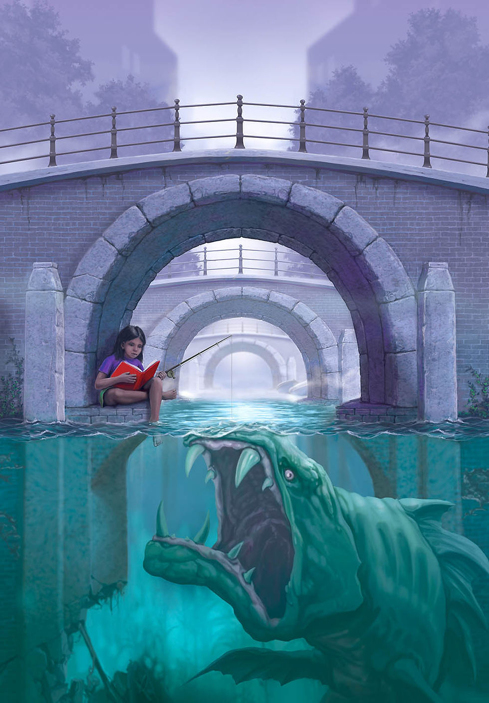
How did you decide on the visual quality of the Goosebumps books? What made you pick such vibrant colors?
I had done another bunch of covers for a group of Scholastic books; these were very formula oriented — there was always some sort of building and some kind of hint to the mystery — so I did a lot of that low “worms-eye” view perspective and I started to push the colors. What I tried to do was keep it colorful in the well lit angle, to focus the viewer’s attention on wherever it was lit best, because that’s where all the color was. So, I was already starting to do that in my other illustrations when the very first Goosebumps comes along, Welcome to Dead House.
But, I wasn’t the only artist chosen at the beginning to do the Goosebumps covers. There was another artist — named Jim Thiesen, an established horror illustrator — who Scholastic thought may do well at it. So, I did book one, Welcome to the Dead House, and he did book two, Stay Out of the Basement. He did an awesome cover — super good cover — but, the thing that everyone touched on was color, mine was less threatening. That’s where it all started, Scholastic conveyed to me that it was working.
As we made more books, I tried to make sure that all the covers had different color combinations; it was a conscious effort. I’ve always done a 6” x 6” practice painting before I started the final art. So, I tried my best to make them look different. I also give props to whoever was the book designer at the time. I’m not quite sure who it was, but the person made sure that the borderline dripping goo and the Goosebumps lettering had changed every time, so when you line up all of the 62 original Goosebumps, there are no combinations of colors that repeat.

Do you have favorite covers?
Egg Monsters from Mars, and Monster Blood II — because I had to make a hamster that was adorable and horrible at the same time — I like that one.
What other projects have you worked on?
I did some work on comic books. I did stuff that was strictly landscapes for travel magazines. I did pharmaceutical illustrations — I actually did a number of those. I’ll tell you what, there are not many differences between horror illustration and medical illustration. You get real images of something, like an organ, and your job is to make them very clear — to make things more defined. It’s very cool, because your work could actually be helping somebody.
So, in that case, you’re like an image editor? You clarify medical images and make them accessible for the layman?
I think you hit the nail on the head there.
How do you feel about your work with Goosebumps now?
It’s unbelievable! It’s almost incomprehensible that we did the first one in 1992. Here is 2020 and Goosebumps is still a subject that people want to hear and talk about. It’s been so cool!
Note* Images are the creative and intellectual property of Tim Jacobus and Scholastic Publishing.